解析:純 CSS 的圈圈叉叉


Posted by ArvinH on 2019-05-25

前言

在很久之前寫過一篇使用 CSS 繪圖的文章,但 CSS 能做的不僅止於此,利用 Pure CSS 製作遊戲的大有人在,像是 Pure CSS Games collection 裡面羅列的。

不過你知我知你隔壁戴眼鏡的也知,純 CSS 製作的圖畫或是遊戲,實作成本高、閱讀性不佳,也難以調教效能,幾乎無法應用到實際產品上。

可是很好玩啊!利用有限條件加上各種技巧想辦法完成預想中的效果,成就感是很大的,能夠有能力跟時間製作出這樣的作品,我覺得是很奢侈的幸福。

老實說我還沒有那個能力做到如此地步,但從觀察他人的作品就能學習到很多有趣的技巧!

今天就來分析一下在 codepen 上看到的這個純 CSS 圈圈叉叉是怎麼實做出來的:

See the Pen CSS Tic-Tac-Toe by Alvaro Montoro (@alvaromontoro) on CodePen.

觀察一下功能

Behavior

這個作品的完成度很高,實作出來的有以下功能:

  • 點選方格後,能夠留下不同 style 的 X 或是 O。
  • 滑鼠 hover 到方格上時,也還能輪流出現圈圈叉叉,讓你知道現在是輪到哪個玩家。
  • 遊戲結束時,能夠跳出選項重新玩。

對於 CSS 稍微敏銳一些,或是有看過類似作品的實作方式的讀者,應該蠻快可以猜到第一點能夠過什麼樣的技巧達成。但作者是如何讓圈圈與叉叉交替出現,我倒是無法很快想出來。

如果你也跟我一樣,別怕!

接下來我們從功能面來一步步拆解他所使用到的技巧,大家可以對照原作者程式碼看,會更好理解。

依靠純 CSS 如何在使用者點擊元素後,進而變更元素狀態呢?

透過 input[type=radio]:check 僞類別的結合,我們就能製造出點擊與非點擊的兩種狀態:

/* ... 省略 ... */
input[id*='-8-x']:checked ~ #board #tile-8 div::before {
  content: "X";
  background: #004974;
  color: #89dcf6;
}

/* ... 省略 ... */
input[id*='-8-o']:checked ~ #board #tile-8 div::before {
  content: "O";
  background: #a60011;
  color: #ffc7b5;
}

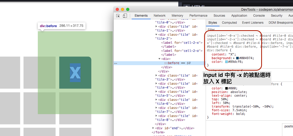
從原作程式碼中,可以看到有許多類似 pattern 的 selector,其中上面這兩種就是在處理 X 玩家與 O 玩家各自點擊了 board 上的一個空格後,該進行的 CSS 樣式改變。

input[id*='-8-x'],代表的是 選取所有 id attribute 中『包含』字串 '-8-x' 的 input 元素 。接著加上 :check 就能 filter 出被使用者選取的 input 元素。

而後面的 ~ #board #tile-8 div::before 則是表示,在符合上面條件的 input 元素所有符合 #board #tile-8 div 的 div 內,我們加上一個 ::before 僞元素,並且設定其 css 為 content: "X"

這樣的一段 CSS selector 被觸發後,就可以達到點擊後留下 X 標記的效果了:

X 玩家點擊空格

從中可以明顯看出,作者是利用 -o-x 這兩種 postfix 當作 X 玩家與 O 玩家的曲別,今天若是 id attribute 中含有 -0 的 input 元素被點選,就是 O 玩家點擊空格,得放入 O

此外,由於 input[type=radio] 元素,在瀏覽器中的固定樣式就是一個圓形選擇鈕,要替換成井字空格,並且又能觸發點擊的方式,就是結合 formlabel 元素,綁定對應的 input 按鈕:

<form id="tictactoe">
  <input type="radio" name="cell-0" id="cell-0-x" />
  <input type="radio" name="cell-0" id="cell-0-o" />
  <!-- ... 省略 ... -->
  <input type="radio" name="cell-8" id="cell-8-x" />
  <input type="radio" name="cell-8" id="cell-8-o" />
  <div id="board" class="center">
    <div class="tile" id="tile-0">
      <label for="cell-0-x"></label>
      <label for="cell-0-o"></label>
      <div></div>
    </div>
    <!-- ... 省略 ... -->
    <div class="tile" id="tile-8">
      <label for="cell-8-x"></label>
      <label for="cell-8-o"></label>
      <div></div>
    </div>
  </div>
  <!-- ... 省略 ... -->
</form>

如此一來,我們可以把 input 按鈕藏到畫面看不到的地方,然後輕易套用任何 style 到 label 上頭,做出井字空格。

input[type="radio"] {
  position: absolute;
  top: -9999em; /* 藏到畫面外 */
}

Hover 出後出現額外元素很常見,但怎麼讓他交替出現不同元素?

好,知道怎麼透過 input[type=radio] 來更改空格狀態之後,我們來研究作者是如何透過 Hover 後的不同樣式,呈現出 X 玩家與 O 玩家輪流的感覺呢?

要在游標 hover 時出現元素,就是結合僞類別與僞元素來在 Hover 到的空格上加入 XO。:

.tile label[for$='-o']:hover::before {
  content: "O";
}
.tile label[for$='-x']:hover::before {
  content: "X";
}

到這邊為止都不稀奇,不過還無法理解為何可以交替出現。

解答在原始碼中這段看起來很可怕的 css:

label[for$='-x'] {
  z-index: 1;
}

input:checked ~ #board label[for$='-o'] {
  z-index: 2;
}

input:checked ~ input:checked ~ #board label[for$='-x'] {
  z-index: 3;

}

input:checked ~ input:checked ~ input:checked ~ #board label[for$='-o'] {
  z-index: 4;
}
/* ... 省略一段 z-index 5 ~ 8 ... */

input:checked ~ input:checked ~ input:checked ~ input:checked ~ input:checked ~ input:checked ~ input:checked ~ input:checked ~ #board label[for$='-x'] {
  z-index: 9;

前面我們有提到,作者是利用 label 來做出井字空格以及 hover 後呈現的 XO 符號,而在 html 中可以看到每個空格底下都有這樣的結構:

<div class="tile" id="tile-0">
  <label for="cell-0-x"></label>
  <label for="cell-0-o"></label>
  <div></div>
</div>

搭配上方的 CSS,我們就能知道作者是透過更改 label 的 z-index交替地觸發 .tile label[for$='-o']:hover::before.tile label[for$='-x']:hover::before,進而達到想要的效果。

至於控制的方式就是透過 :check 為 true 的 input 數量:

當沒有任何一個 radio input 被 check 時,設定所有 for attribute 結尾為 -xlabelz-index 為 1,就會讓游標 hover 到空格時,會是 <label for="cell-0-x"></label> 的 hover 被觸發,而不是 <label for="cell-0-o"></label>

若有一個 radio input 被選擇後,代表要換成 O 玩家,input:checked ~ #board label[for$='-o'] 就被觸發了,所有 for attribute 結尾為 -olabelz-index 變為 2,大於剛剛的 x label,這時使用者在 hover 到任何一個空格時,出現的就通通都會是 O 了!

雖然這樣的做法讓 CSS 蠻冗長的,但還是不得不讚嘆作者能想出利用 z-index 來製造出這樣的效果,真的很厲害啊...閱讀性也算很高的。

判斷輸贏以及重新遊玩的功能怎麼實作?

在遊戲結束的時候,不管是哪種結果,畫面上都會疊上一層訊息與重新遊玩的按鈕,這部分的 html 藏在最下方含有 end class name 的 div 內:

<div id="end">
  <div id="message" class="center">
    <div>
      <input type="reset" for="tictactoe" value="Play again" />
    </div>
  </div>
</div>

由於整個遊戲都是包含在一個 form 中,所以可以直接透過 type 為 reset 的 input 按鈕來重設所有的 radio button 狀態,達到重新遊玩的功能。

而顯示訊息框以及判斷輸贏的方法其實蠻暴力的,就是一一檢查各種組合,橫的、直的與斜的:

#cell-0-x:checked ~ #cell-1-x:checked ~ #cell-2-x:checked ~ #end #message::before,
#cell-3-x:checked ~ #cell-4-x:checked ~ #cell-5-x:checked ~ #end #message::before,
#cell-6-x:checked ~ #cell-7-x:checked ~ #cell-8-x:checked ~ #end #message::before,
#cell-0-x:checked ~ #cell-3-x:checked ~ #cell-6-x:checked ~ #end #message::before,
#cell-1-x:checked ~ #cell-4-x:checked ~ #cell-7-x:checked ~ #end #message::before,
#cell-2-x:checked ~ #cell-5-x:checked ~ #cell-8-x:checked ~ #end #message::before,
#cell-0-x:checked ~ #cell-4-x:checked ~ #cell-8-x:checked ~ #end #message::before,
#cell-2-x:checked ~ #cell-4-x:checked ~ #cell-6-x:checked ~ #end #message::before {
  content: "Player 1 won!";
}

#cell-0-o:checked ~ #cell-1-o:checked ~ #cell-2-o:checked ~ #end #message::before,
#cell-3-o:checked ~ #cell-4-o:checked ~ #cell-5-o:checked ~ #end #message::before,
#cell-6-o:checked ~ #cell-7-o:checked ~ #cell-8-o:checked ~ #end #message::before,
#cell-0-o:checked ~ #cell-3-o:checked ~ #cell-6-o:checked ~ #end #message::before,
#cell-1-o:checked ~ #cell-4-o:checked ~ #cell-7-o:checked ~ #end #message::before,
#cell-2-o:checked ~ #cell-5-o:checked ~ #cell-8-o:checked ~ #end #message::before,
#cell-0-o:checked ~ #cell-4-o:checked ~ #cell-8-o:checked ~ #end #message::before,
#cell-2-o:checked ~ #cell-4-o:checked ~ #cell-6-o:checked ~ #end #message::before {
  content: "Player 2 won!";
}

並將含有 end class 的 div 設為 display: block,當然,也是要確定所有 checked 狀態都是正確的(已經結束):

input:checked ~ input:checked ~ input:checked ~ input:checked ~ input:checked ~ input:checked ~ input:checked ~ input:checked ~ input:checked ~ #end,
#cell-0-x:checked ~ #cell-1-x:checked ~ #cell-2-x:checked ~ #end,
#cell-3-x:checked ~ #cell-4-x:checked ~ #cell-5-x:checked ~ #end,
#cell-6-x:checked ~ #cell-7-x:checked ~ #cell-8-x:checked ~ #end,
#cell-0-x:checked ~ #cell-3-x:checked ~ #cell-6-x:checked ~ #end,
#cell-1-x:checked ~ #cell-4-x:checked ~ #cell-7-x:checked ~ #end,
#cell-2-x:checked ~ #cell-5-x:checked ~ #cell-8-x:checked ~ #end,
#cell-0-x:checked ~ #cell-4-x:checked ~ #cell-8-x:checked ~ #end,
#cell-2-x:checked ~ #cell-4-x:checked ~ #cell-6-x:checked ~ #end,
#cell-0-o:checked ~ #cell-1-o:checked ~ #cell-2-o:checked ~ #end,
#cell-3-o:checked ~ #cell-4-o:checked ~ #cell-5-o:checked ~ #end,
#cell-6-o:checked ~ #cell-7-o:checked ~ #cell-8-o:checked ~ #end,
#cell-0-o:checked ~ #cell-3-o:checked ~ #cell-6-o:checked ~ #end,
#cell-1-o:checked ~ #cell-4-o:checked ~ #cell-7-o:checked ~ #end,
#cell-2-o:checked ~ #cell-5-o:checked ~ #cell-8-o:checked ~ #end,
#cell-0-o:checked ~ #cell-4-o:checked ~ #cell-8-o:checked ~ #end,
#cell-2-o:checked ~ #cell-4-o:checked ~ #cell-6-o:checked ~ #end {
  display: block;
}

主要的實作重點大概就到這邊,剩下還有一些像是 radio button 被 check 後,把原有 label 設為 display: none 的部分就是為了讓畫面更好看而已,實作方式跟上面的 selector 都大同小異。

實作技巧整理

最後稍微統整一下實作的技巧:

  • 實作技巧 1 - 善用 form 元素: input[type=radio]label

    利用 radio button 來達成切換狀態的操作,在各種以純 CSS 製作的應用中,幾乎是必備出現的技巧,這邊也不例外。

    透過 input 元素,我們可以從 :check 這個 Pseudo-class 來判斷使用者的點擊與否。

  • 實作技巧 2 - CSS selector 可不是只有 id 與 class

    活用 attribute selector 與 僞元素、僞類別,可以帶來很多意想不到的妙用,像是 label[for$='-o']:check 等等。

  • 實作技巧 3 - 藏東西不是只能用 display,還有 z-index 呢

    利用 z-index 的階層關係,控制觸發 hover 的元素,讓我們多了一種隱藏物件的方式。

  • 實作技巧 4 - CSS Grid

    雖然在前面並沒有提到,但作者是利用 CSS Grid 畫出表格,這在 Modern web browser 上是最經濟實惠的方法:

    <div id="board" class="center">
        <div class="tile" id="tile-0">
          <div></div>
        </div>
        <div class="tile" id="tile-1">
          <div></div>
        </div>
        <!-- 
          ...  依此類推將九個格子填滿
        -->
      </div>
    
    /*
    ... 省略
    */
    #board {
      width: 50vmin;
      height: 50vmin;
      display: grid;
      grid-template-columns: 1fr 1fr 1fr;
      grid-template-rows: 1fr 1fr 1fr;
    }
    
    #tile-0 {
      grid-column: 1;
      grid-row: 1;
    }
    
    #tile-1 {
      grid-column: 2;
      grid-row: 1;
    }
    /*
    ... 省略
    */
    

結論

每每看到 codepen 上一些神奇的作品,都會讓我有 mind-blowing 的感覺,雖然大多時候難以理解實作原理,但偶而還是會看到類似這次範例一般,好理解,又能學到不少技巧的作品。
希望對 CSS 不那麼熟悉的讀者,透過這次的分析,也能看得懂背後的原理,然後對利用 CSS 繪圖或是製作 no-js 的作品有所興趣,雖然沒什麼實際用途,但我自己覺得能夠利用專業玩出一些好玩的東西真的蠻吸引人的!

資料來源

  1. CSS Tic-Tac-Toe - Alvaro Montoro

關於作者:
@arvinh 前端攻城獅,熱愛數據分析和資訊視覺化


#css


Related Posts

Beaglebone Black 刷新 EMMC 筆記

Beaglebone Black 刷新 EMMC 筆記

我要成為前端工程師的學習筆記:HTML & CSS 篇 - Box Model、區塊水平置中、文字水平調整 Day7

我要成為前端工程師的學習筆記:HTML & CSS 篇 - Box Model、區塊水平置中、文字水平調整 Day7

How to install VirtualBox & Ubuntu

How to install VirtualBox & Ubuntu


Newsletter


Comments