用 Python 自學資料科學與機器學習入門實戰:Matplotlib 基礎入門
![]()
前言
本系列文章將透過系統介紹資料科學(Data Science)相關的知識,透過 Python 帶領讀者從零開始進入資料科學的世界。這邊我們將介紹 Matplotlib 這個 Python 資料視覺化的核心工具。
什麼是 Matplotlib?
Python 的視覺化套件有靜態的 Matplotlib、Seaborn 和 ggplot(借鏡於 R 的 ggplot2)套件以及動態的 Bokeh 套件(類似於 D3.js)。其中 Matplotlib 是 Python 的一個重要模組(Python 是一個高階語言也是一種膠水語言,可以透過整合其他低階語言同時擁有效能和高效率的開發),主要用於資料視覺化上。一般來說使用 Matplotlib 有兩種主要方式:直接和 Matplotlib 的全域 pyplot 模組互動操作,第二種則是物件導向形式的操作方式。若是只有一張圖的話使用全域 pyplot 很方便,若是有多張圖的話用物件導向操作。一般來說 Matplotlib 預設值並不理想,但它的優點在於很容易在上面外包一層提供更好的預設值或是自己修改預設值。
第一張 Matplotlib 圖片
1 | # 引入模組 |
1 | x = pd.period_range(pd.datetime.now(), periods=200, freq='d') |
常用屬性和參數調整
1 | # Matplotlib 使用點 point 而非 pixel 為圖的尺寸測量單位,適合用於印刷出版。1 point = 1 / 72 英吋,但可以調整 |
物件導向式 Matplotlib
1 | # 設定標籤 |
1 | # 標題與軸標籤 |
1 | # 儲存圖表 |
<matplotlib.figure.Figure at 0x120e70828>
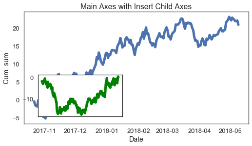
1 | # 使用物件導向方式控制圖表,透過控制 figure 和 axes 來操作。其中 figure 和全域 pyplot 部分屬性相同。例如: fig.text() 對應到 plt.fig_text() |
<matplotlib.figure.Figure at 0x120c16940>
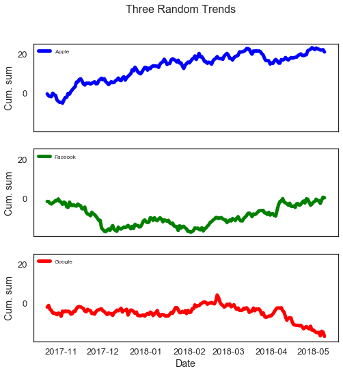
1 | # 軸與子圖表 |
1 | # 單一圖與軸繪製(subplots 不帶參數回傳擁有一軸 figure 物件,幾乎等同於 matplotlib 全域物件) |
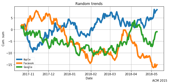
1 | # 使用子圖表 |
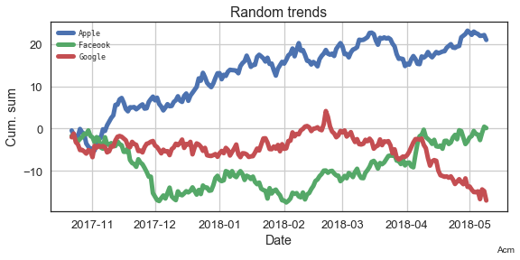
1 | # 使用子圖表產生多個圖表 |
<matplotlib.text.Text at 0x11eb71278>
常見圖表
直方圖(Histogram)
1
2
3
4
# 直方圖
normal_samples = np.random.normal(size=100) # 生成 100 組標準常態分配(平均值為 0,標準差為 1 的常態分配)隨機變數
plt.hist(normal_samples, width=0.1)
plt.show()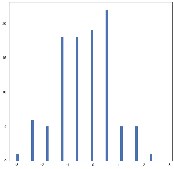
散佈圖(Scatter plot)
1
2
3
4
5
6
7
8
9
10# 散佈圖
num_points = 100
gradient = 0.5
x = np.array(range(num_points))
y = np.random.randn(num_points) * 10 + x * gradient
fig, ax = plt.subplots(figsize=(8, 4))
ax.scatter(x, y)
fig.suptitle('A Simple Scatter Plot')
plt.show()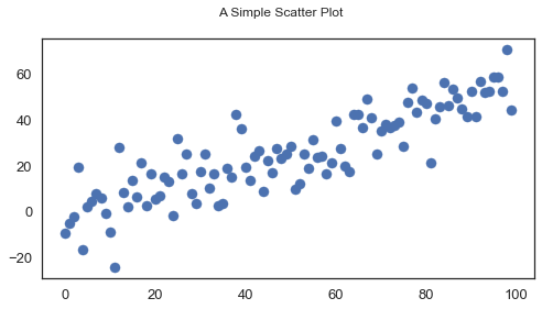
1
2
3
4
5
6
7
8
9
10
11
12
13
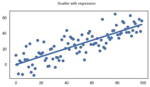
14# 散佈圖 + 迴歸
num_points = 100
gradient = 0.5
x = np.array(range(num_points))
y = np.random.randn(num_points) * 10 + x * gradient
fig, ax = plt.subplots(figsize=(8, 4))
ax.scatter(x, y)
m, c = np.polyfit(x, y, 1) # 使用 Numpy 的 polyfit,參數 1 代表一維,算出 fit 直線斜率
ax.plot(x, m * x + c) # 使用 y = m * x + c 斜率和常數匯出直線
fig.suptitle('Scatter with regression')
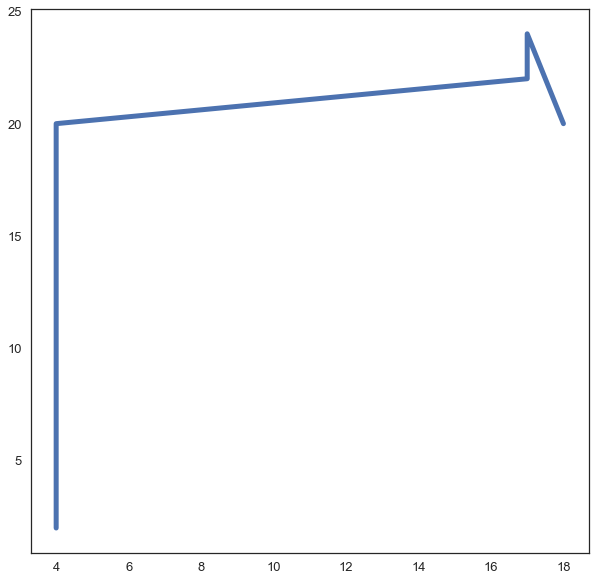
plt.show()線圖(Line plot)
1
2
3
4
5
6# 線圖
age = [4, 4, 17, 17, 18]
points = [2, 20, 22, 24, 20]
plt.plot(age, points)
plt.show()長條圖(Bar plot)
1
2
3
4
5
6
7
8
9
10# 長條圖
labels = ['Physics', 'Chemistry', 'Literature', 'Peace']
foo_data = [3, 6, 10, 4]
bar_width = 0.5
xlocations = np.array(range(len(foo_data))) + bar_width
plt.bar(xlocations, foo_data, width=bar_width)
plt.title('Stock Price')
plt.show()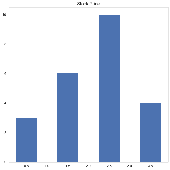
盒鬚圖(Box plot)
1
2
3
4
5# 盒鬚圖
normal_examples = np.random.normal(size = 100) # 生成 100 組標準常態分配(平均值為 0,標準差為 1 的常態分配)隨機變數
plt.boxplot(normal_examples)
plt.show()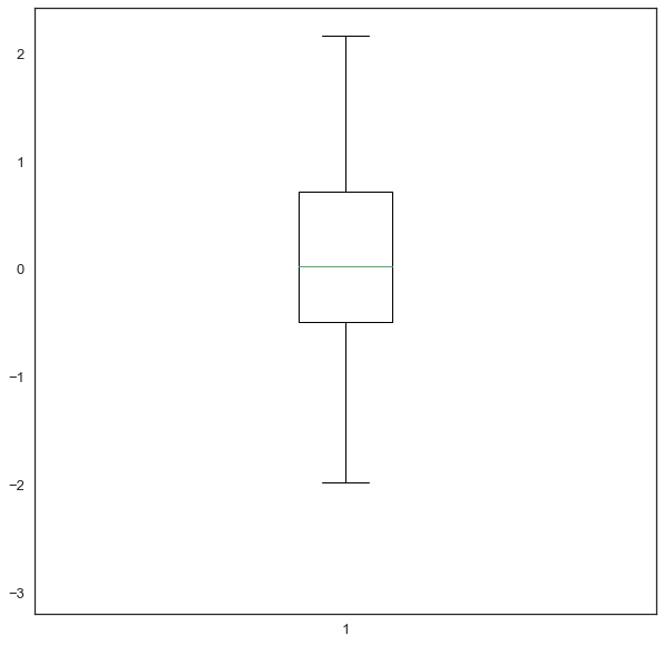
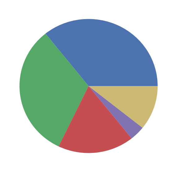
圓餅圖(Pie plot)
1
2
3
4
5
6
7
8# 圓餅圖
data = np.random.randint(1, 11, 5) # 生成
x = np.arange(len(data))
plt.pie(data)
plt.show()
Python 其他資料視覺化套件
Seaborn
1
2
3
4
5
6
7
8
9
10
11
12
13
14
15
16
17
18
19
20
21
22
23
24
25
26
27
28
29
30
31# Seaborn
import numpy as np
import seaborn as sns
import matplotlib.pyplot as plt
sns.set(style="white", context="talk")
rs = np.random.RandomState(7)
# 準備 matplotlib 圖表
f, (ax1, ax2, ax3) = plt.subplots(3, 1, figsize=(8, 6), sharex=True)
# 產生連續資料
x = np.array(list("ABCDEFGHI"))
y1 = np.arange(1, 10)
sns.barplot(x, y1, palette="BuGn_d", ax=ax1)
ax1.set_ylabel("Sequential")
# 調整成 diverging 資料
y2 = y1 - 5
sns.barplot(x, y2, palette="RdBu_r", ax=ax2)
ax2.set_ylabel("Diverging")
# 隨機資料
y3 = rs.choice(y1, 9, replace=False)
sns.barplot(x, y3, palette="Set3", ax=ax3)
ax3.set_ylabel("Qualitative")
# 秀出圖片
sns.despine(bottom=True)
plt.setp(f.axes, yticks=[])
plt.tight_layout(h_pad=3)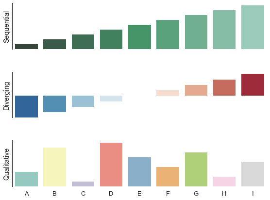
Bokeh
1
2
3
4
5
6
7
8
9
10
11
12
13
14
15
16
17
18# Bokeh
from bokeh.plotting import figure, output_file, show
# 準備資料
x = [1, 2, 3, 4, 5]
y = [6, 7, 2, 4, 5]
# 輸出成靜態 HTML
output_file("lines.html")
# 創建新的標題和軸圖表
p = figure(title="simple line example", x_axis_label='x', y_axis_label='y')
# 繪製直線圖
p.line(x, y, legend="Temp.", line_width=2)
# 呈現結果
show(p)
總結
以上介紹了 Matplotlib 的基礎知識和 api,同時也介紹了 Python 其他資料視覺化套件。一般來說 Matplotlib 預設值並不理想,但它的優點在於很容易在上面外包一層提供更好的預設值或是自己修改預設值。一般來說我們在進行資料科學和機器學習分析的過程中我們會先使用資訊視覺化工具來了解整個資料集的特色並針對資料進行後續的處理和特徵選取,所以說資料視覺化不僅能呈現資料分析的結果,對於資料分析的過程也十分重要。
延伸閱讀
(image via matplotlib
關於作者:
@kdchang 文藝型開發者,夢想是做出人們想用的產品和辦一所心目中理想的學校。A Starter & Maker. JavaScript, Python & Arduino/Android lover.:)
留言討論